Print design is a fundamental aspect of graphic design that continues to hold importance in a digital world. While digital media has become prevalent, print design offers a unique sensory experience and tangible connection that cannot be replicated online. In this article, we will explore the key elements of effective print design, best practices, and tips for creating memorable print designs.
Key Takeaways
- Print design engages the senses and offers a tangible experience that digital media cannot replicate.
- Typography plays a crucial role in print design, and choosing the right fonts is essential for maximum impact.
- Understanding color theory is important for creating harmonious and eye-catching print designs.
- Layout and composition are key elements of effective print design, helping to organize elements for visual hierarchy.
- When designing for print, it is important to consider print specifications such as DPI, bleed, and margins.
Understanding the Importance of Print Design

Why Print Design Still Matters in a Digital World
In today’s digital age, it’s easy to overlook the importance of print design. With everything moving online, you might wonder if print is still relevant. But let me tell you, print design is far from dead. It still holds a special place in the hearts of many, and for good reason.
Print design offers a unique experience that digital media simply can’t replicate. There’s something magical about holding a physical piece of art in your hands, feeling the texture of the paper, and smelling the ink. It engages your senses in a way that a screen just can’t.
When it comes to typography in graphic design, print allows for more creativity and control. You have the freedom to choose from a wide range of fonts, experiment with different sizes and styles, and play with the layout to create a visually stunning design. The right typography can make a huge impact and convey the message of your design effectively.
In addition, print design offers a sense of permanence. Unlike digital content that can be easily deleted or forgotten, print materials have a physical presence that can last for years. They can be displayed, shared, and cherished, creating a lasting impression on the viewer.
So, don’t underestimate the power of print design. It may seem old-fashioned in this digital world, but it still has a lot to offer. Whether it’s a business card, a brochure, or a poster, print design allows you to create something tangible and memorable. Embrace the beauty of print and let your creativity shine!
The Power of Tangibility: How Print Design Engages the Senses
When it comes to print design, there’s something special about holding a physical piece in your hands. The tactile experience of flipping through a magazine or feeling the texture of a business card creates a connection that digital design simply can’t replicate. Print design allows you to engage multiple senses, from the visual appeal of a well-designed layout to the tactile sensation of running your fingers over embossed text. It’s a sensory experience that brings a unique charm to your message. In a world dominated by screens and pixels, print design offers a refreshing break and a chance to appreciate the ancient art of graphic design.
Key Elements of Effective Print Design

Typography: Choosing the Right Fonts for Maximum Impact
When it comes to typography in print design, choosing the right fonts can make a huge difference in the overall impact of your design. The fonts you select can convey a specific mood or tone, and they can also enhance readability and legibility. It’s important to consider the message you want to communicate and the target audience when selecting fonts. Graphic design principles such as hierarchy, contrast, and alignment should also be taken into account.
To ensure maximum impact, here are a few tips to keep in mind:
- Choose fonts that complement each other: Pairing fonts that have contrasting styles can create visual interest and help guide the reader’s eye.
- Pay attention to font size and spacing: Adjusting the size and spacing of your fonts can improve readability and make your design more visually appealing.
- Experiment with different font weights and styles: Using variations of the same font can add depth and visual hierarchy to your design.
Remember, typography is not just about selecting fonts; it’s about using them strategically to create a cohesive and impactful design.
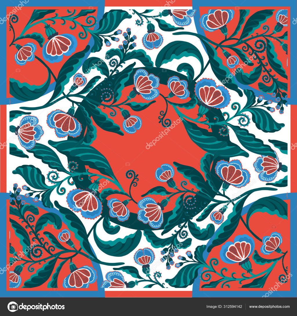
Color Theory: Creating Harmonious and Eye-Catching Designs
When it comes to print design, color theory plays a crucial role in creating designs that are visually appealing and impactful. Understanding how colors work together can help you create harmonious and eye-catching designs that grab attention.
One important aspect of color theory is the use of complementary colors. These are colors that are opposite each other on the color wheel, such as blue and orange or red and green. Using complementary colors in your print designs can create a strong contrast and make elements stand out.
Another key concept in color theory is the idea of warm and cool colors. Warm colors like red, orange, and yellow evoke feelings of energy and excitement, while cool colors like blue, green, and purple create a sense of calm and tranquility. By understanding the emotional impact of different colors, you can use them strategically in your print designs to evoke specific moods or emotions.
In addition to understanding color theory, it’s also important to consider the psychology of color. Different colors can have different psychological effects on viewers. For example, red is often associated with passion and intensity, while blue is associated with trust and reliability. By choosing the right colors for your print designs, you can create a subconscious connection with your audience and convey the desired message.
When designing with color, it’s essential to pay attention to contrast and readability. Ensure that text is easily readable against the background color and that important elements stand out. Experiment with different color combinations and test your designs in various lighting conditions to ensure they are effective in different contexts.
Remember, color theory is just one aspect of creating harmonious and eye-catching print designs. By combining color theory with other design principles and your own creativity, you can create stunning and impactful designs that leave a lasting impression.
Layout and Composition: Organizing Elements for Visual Hierarchy
When it comes to print design, page layout in graphic design plays a crucial role in creating a visually appealing and effective design. It involves arranging and organizing various elements on a page to guide the reader’s eye and create a sense of hierarchy. By strategically placing elements such as text, images, and graphics, you can direct the viewer’s attention and convey your message more effectively.
One important aspect of page layout is the use of grids. Grids provide a framework for organizing content and maintaining consistency throughout the design. They help create a sense of order and structure, making it easier for the reader to navigate the page. By aligning elements to the grid, you can achieve a balanced and harmonious layout.
Another key consideration in page layout is the use of white space. White space, also known as negative space, is the empty space between elements. It helps create breathing room and allows the design to breathe. By strategically using white space, you can enhance the visual impact of your design and make it more visually appealing.
In addition to grids and white space, typography also plays a crucial role in page layout. Choosing the right fonts can greatly impact the overall look and feel of your design. Different fonts convey different emotions and personalities, so it’s important to choose fonts that align with your message and brand identity. Consider factors such as readability, legibility, and hierarchy when selecting fonts for your design.
In conclusion, page layout in graphic design is a fundamental aspect of print design. By understanding the principles of layout and composition, and utilizing tools such as grids, white space, and typography, you can create visually appealing and effective designs that engage your audience and convey your message with impact.
Print Design Best Practices

Understanding Print Specifications: DPI, Bleed, and Margins
When it comes to print design, understanding the specifications is crucial. DPI, bleed, and margins are key elements that can greatly impact the final result of your design. DPI, or dots per inch, refers to the resolution of an image or document. It determines the level of detail and sharpness in your print. The higher the DPI, the better the quality. Bleed is the area outside the final trim size where your design extends. It ensures that there are no white edges when the print is trimmed. Margins, on the other hand, are the safe zones within the trim size where important elements should be placed to avoid getting cut off. By understanding and properly implementing these specifications, you can ensure that your print design looks professional and polished.
Choosing the Right Paper and Finishes for Different Projects
When it comes to print design, choosing the right paper and finishes is crucial. The paper you select can greatly impact the overall look and feel of your design. Graphic design resources can provide valuable insights and recommendations on the best paper options for different projects. Whether you’re creating a brochure, flyer, or business card, understanding the characteristics of different paper types is essential.
To make an informed decision, consider factors such as weight, texture, and finish. Heavier paper stocks can convey a sense of quality and durability, while textured papers can add a tactile element to your design. Additionally, finishes like gloss, matte, or satin can enhance the visual appeal and protect the printed materials.
When selecting paper and finishes, it’s important to align them with the purpose and target audience of your project. For example, a high-end luxury brand may opt for premium paper with a sophisticated finish, while a playful and vibrant design may benefit from a glossy or metallic finish.
Remember, the right paper and finishes can elevate your print design and leave a lasting impression on your audience.
Designing for Different Print Mediums: Brochures, Flyers, and Business Cards
When it comes to designing for different print mediums like brochures, flyers, and business cards, there are a few key considerations to keep in mind. First, graphic design shapes play a crucial role in creating visually appealing and impactful designs. Whether it’s using geometric shapes to add structure or organic shapes to evoke emotion, the choice of shapes can greatly enhance the overall design. Additionally, it’s important to consider the size and placement of the shapes to ensure they don’t overpower the other elements on the print medium.
Another important aspect to consider is the use of color. Color psychology plays a significant role in print design, as different colors can evoke different emotions and convey different messages. It’s important to choose colors that align with the purpose and message of the print medium. For example, vibrant and bold colors may be suitable for a flyer promoting a music festival, while softer and more muted colors may be appropriate for a business card for a professional service.
In terms of typography, it’s essential to choose fonts that are legible and appropriate for the print medium. Font pairing is also important to create visual interest and hierarchy. Combining a bold and attention-grabbing font for headings with a clean and easy-to-read font for body text can help guide the reader’s attention and make the information more digestible.
Lastly, the layout and composition of the print medium should be carefully considered. Visual hierarchy is key to ensuring important information stands out and is easily accessible. Using techniques such as varying font sizes, bold or italicized text, and strategic placement of elements can help create a clear and organized layout. It’s also important to leave enough white space to prevent the design from feeling cluttered and overwhelming.
In summary, when designing for different print mediums, consider the use of graphic design shapes, the psychology of color, the choice of fonts, and the layout and composition to create visually appealing and effective designs.
Tips for Creating Memorable Print Designs

Using Visual Storytelling to Capture Attention
When it comes to creating memorable print designs, visual storytelling is a powerful tool that can captivate your audience. By using compelling visuals and engaging narratives, you can effectively communicate your message and leave a lasting impression.
Visual storytelling allows you to convey complex ideas and emotions in a way that is easy to understand and connect with. It taps into the power of visual communication to evoke emotions, spark curiosity, and create a sense of connection with your audience.
To effectively use visual storytelling in your print designs, consider the following tips:
- Choose the right images: Select images that align with your message and evoke the desired emotions. Whether it’s a striking photograph, an illustrative graphic, or a captivating illustration, the right image can enhance the storytelling experience.
- Craft a compelling narrative: Develop a storyline or a narrative arc that guides your audience through your design. This can involve using a series of images, captions, or even a short text to create a cohesive and engaging story.
- Use visual cues: Incorporate visual elements such as arrows, lines, or icons to guide the viewer’s attention and enhance the storytelling experience. These visual cues can help direct the viewer’s gaze and highlight important elements within your design.
- Create a sense of anticipation: Build suspense and curiosity by strategically revealing information or using cliffhangers in your design. This can keep your audience engaged and eager to discover what comes next.
Incorporating visual storytelling into your print designs can elevate your work and make it more memorable. By using compelling visuals, crafting a compelling narrative, and using visual cues, you can create designs that capture attention and leave a lasting impression.
Incorporating Unique and Creative Design Elements
When it comes to print design, incorporating unique and creative design elements is essential. It’s what sets your designs apart and grabs the attention of your audience. Balance in design is one key aspect to consider. By achieving a balance between different elements such as color, typography, and layout, you can create visually appealing and impactful designs. Finding the right balance is crucial as it helps create harmony and ensures that no single element overpowers the others. It’s about finding the sweet spot where all the elements work together seamlessly.
Balancing Simplicity and Complexity for Impactful Designs
When it comes to print design, finding the right balance between simplicity and complexity is key. Simplicity allows for clear communication and easy understanding, while complexity adds depth and interest to the design. Here are a few tips to help you achieve the perfect balance:
- Keep it simple: Start with a clean and uncluttered design. Use ample white space to give your elements room to breathe.
- Add layers of complexity: Once you have a solid foundation, consider adding subtle details and textures to create visual interest.
- Focus on hierarchy: Use typography, color, and layout to guide the viewer’s eye and create a clear visual hierarchy.
Tip: Experiment with different levels of simplicity and complexity to find what works best for your design. Remember, the goal is to create an impactful design that captures attention and leaves a lasting impression.
Conclusion
In conclusion, print design is an essential aspect of visual communication. It allows us to convey information, evoke emotions, and create memorable experiences. By understanding the basics of print design, you can effectively communicate your message and captivate your audience. So, whether you’re designing a brochure, a poster, or a business card, remember to pay attention to typography, layout, color, and imagery. Experiment, be creative, and always strive for a balance between aesthetics and functionality. With these fundamental principles in mind, you’ll be well-equipped to create stunning print designs that leave a lasting impression.
Frequently Asked Questions
What is print design?
Print design refers to the creation of visual materials that are intended to be printed, such as brochures, flyers, business cards, and posters. It involves the use of typography, color, and layout to communicate a message effectively.
Why is print design still important in a digital world?
Print design offers a tangible and tactile experience that digital media cannot replicate. It allows for a deeper connection with the audience and can leave a lasting impression. Additionally, print materials can be more easily retained and shared.
What are the key elements of effective print design?
The key elements of effective print design include typography, color theory, and layout and composition. Choosing the right fonts, creating harmonious color schemes, and organizing elements for visual hierarchy are essential for impactful designs.
What is the importance of typography in print design?
Typography plays a crucial role in print design as it sets the tone and conveys the message of the design. Choosing the right fonts, sizes, and spacing can enhance readability, evoke emotions, and create a cohesive visual identity.
How does color theory impact print design?
Color theory is essential in print design as it can evoke specific emotions, create visual interest, and communicate messages effectively. Understanding color harmonies, contrast, and the psychology of colors can greatly enhance the impact of a design.
What should be considered when designing for different print mediums?
When designing for different print mediums such as brochures, flyers, and business cards, it is important to consider the specific requirements and limitations of each medium. Factors such as size, format, and printing techniques should be taken into account to ensure the design translates well onto the chosen medium.